Wednesday, July 30, 2008
Thursday, June 19, 2008
Unreal environment
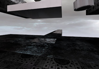
 As you will see the final product was very different to my initial ideas seen in sketchup drafts. This was due to the nature of Unreal editor and also modification throughout the design process.
The circle you can see at the end of the bride was original intended to spin. these were designed to bring the office to the client and thus creating a sense of "the world revolving around them.
 This bridge with holes booleaned out represents the climb to power and sucess, filled with holes with a long way to fall
 The dining area seen above is a costant reminder of the dog eat dog business world and while my clients are eating they too aare made aware o the continuous compition to their entirprise.
 This shot allows you to see both my elevators and som of my custom matieral as well. but for the best view check it out yourself at http://files.filefront.com/z3255344tylersfinalutma
Monday, June 16, 2008
Materials (custom)
Sunday, June 15, 2008
Subscribe to:
Comments (Atom)


